The Problem
The charity had a website that was too difficult to maintain, and with an outdated theme that wasn't representing well the mission and the impact of their work. The charity board recognised that a new website would be essential for attracting donations, increasing the awareness of their mission as well as promoting the positive impact of their work, what they called the impact of giving.
It is crucial that our website is user-friendly, visually appealing and effectively communicates our mission and the impact of our work.
The Objective
We recognised that the website should have been all about emotion, about creating a link between the charity itself and the people, but at the same time, the charity board wanted an easy to use website with a clear information architecture and simple call to actions that would maximise their donations.

The Challenges
- Balancing emotions and usability: The website needed to be emotionally compelling, but at the same time easy to use and navigate. The storytelling needed to be on point, concise but effective.
- Communicating impact: The biggest challenge of this project was to communicate the impact of giving effectively, we wanted to create a connection between the reader and the charity, but at the same time we recognised the difficulties in getting the attention of the healthcare audience, renowned for not having time and patience.
- Limited budget: The budget for this project was very limited, which made it challenging to develop all the desired features and functionalities.


The Actions
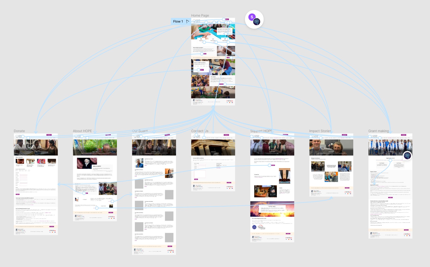
- Card sorting: As the Information Architecture (IA) of the website was one of the key points of the project, I ran a card sorting exercise to understand how to organise and categorise information. We needed to be concise, so the content of the old website needed to be cut and re-organised in a way that made sense, and that funnelled users to the donation form.
- Accessibility testing: We needed to make sure that the website was accessible to all, and this is why I decided to spend most of the time assigned to testing to test the website for accessibility issues. The charity mission was about inclusivity, and we had a duty to include everyone.
- Heatmaps: I used the old website heatmaps to understand how users were interacting with the website, and this made me realise where the pain points were in the layout, what CTAs were working and what needed to be changed or removed.
- Focus group: Since it wasn't possible to run usability testing sessions or listening tours with the existing users, I decided to use a focus group to gather feedback and ideas on the website.
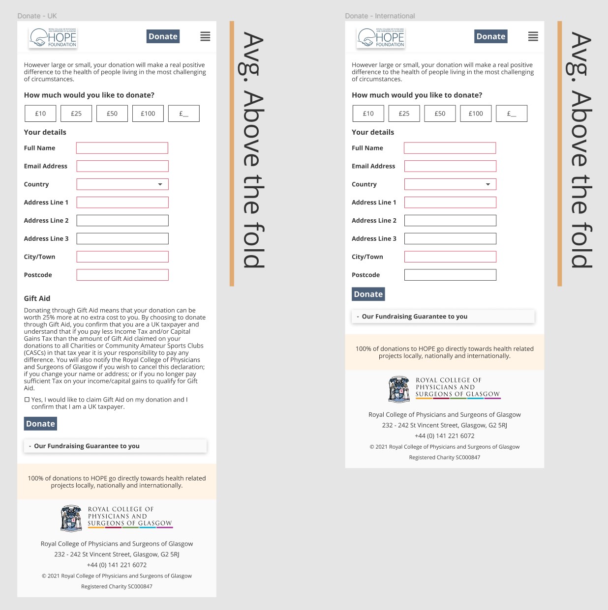
- Prototyping and wireframing: I used Figma to create the structure of the website, first, and then to emulate the final product to get feedback from the internal stakeholders.
Overcoming The Challenges
- Balancing emotions and usability: I worked closely with management to understand the emotional message that they wanted to convey, and what really made the charity what it was, and only after having understood the message myself I've incorporated it into the design and structure of the website.
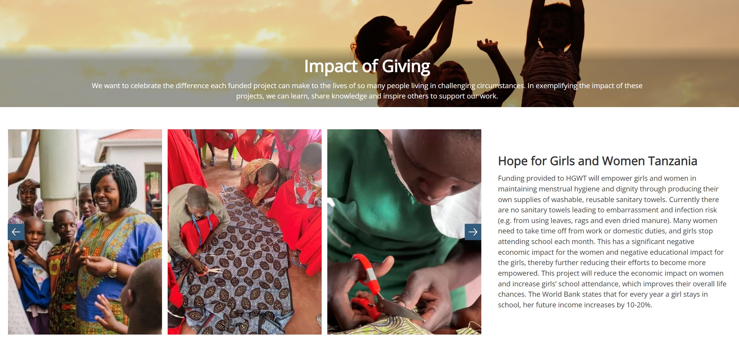
- Communicating impact: If storytelling was used to convey the emotional message, we used data and images to communicate the impact of giving instead.
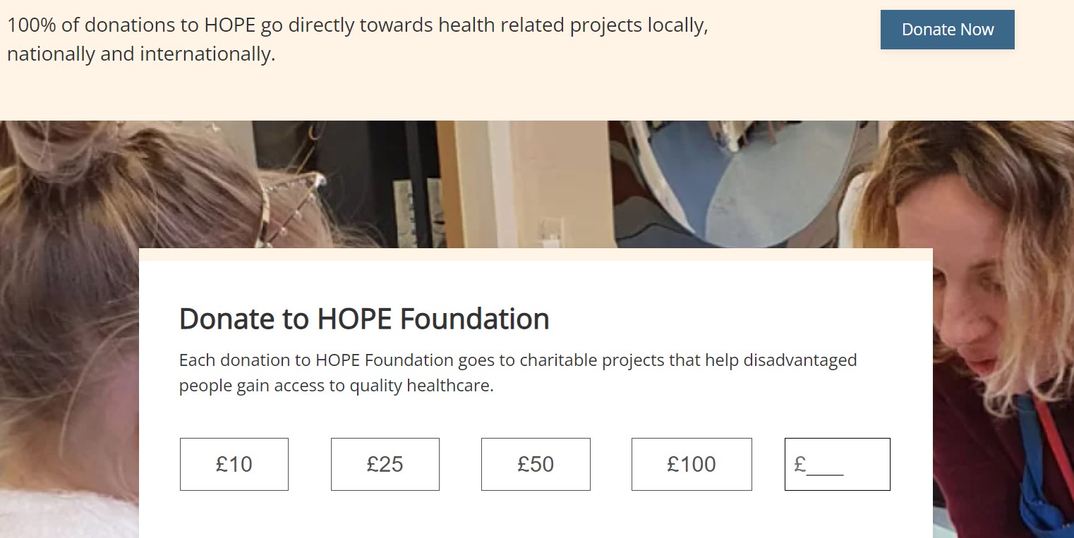
- Limited budget: I prioritised tasks and features focusing on the most important funnel - getting users to the donation form, and letting them donate in the easiest possible way.

The Results
I believe this case study is really important because to me it was a lesson in design, storytelling, emotional design, and the best example of human-centred design. The website was launched successfully on time and budget, and as donations increased I realised that we managed to strike a good balance between emotions and usability.