The Problem
The organisation lacked UX maturity, and its digital presence always resulted in a sub-optimal user experience, as design decisions were often made either by committee or based on someone's gut feeling, rather than data-driven insights and user research. As a result, the main website failed to meet the needs and expectations of its audience. The organisation didn't have established design standards or UX guidelines in place, and this led to a disjointed user experience that was causing frustration among users. In addition to this, the lack of UX maturity was impacting the organisation's ability to achieve its goals in its digital space.
We are losing potential customers, and our website is not helping us achieve our goals.
The Objective
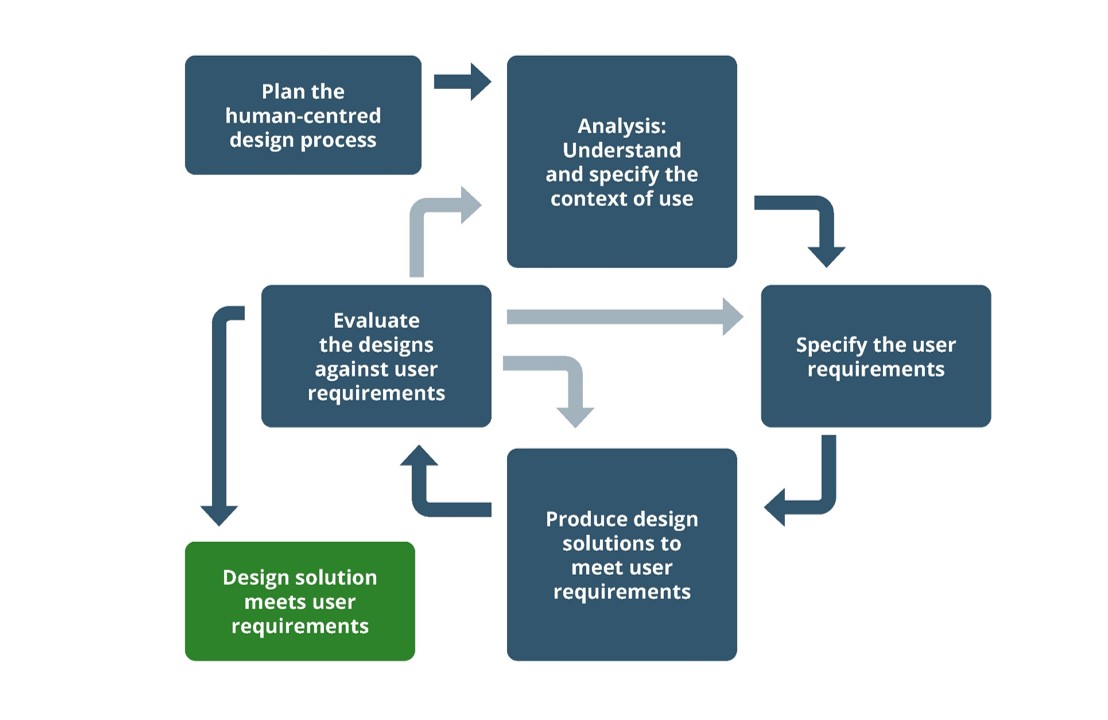
This is one of my biggest projects, as it not only included restructuring and redesigning a website that had more than 4,000 pages, but it was also about redefining the culture of an organisation founded almost 500 years ago! The objective of this project was to lead the redesign of the website from a data-driven and human-centric process, making sure that every decision was based on real user evidence. As part of this project, I also developed a UX framework and a digital strategy for the organisation, creating a user-centric culture working at all levels, starting from the senior management team and working my way through every area of the organisation, creating reports, sharing clips from usability testing sessions and demonstrating that a user-centric culture would benefit the organisation achieving its goals.
The Challenges
- Culture: A user-centric culture was never adopted in the organisation, so for many of them, this was the first time hearing about Human-Centred Design, User Experience and collaborative design.
- Limited Budget: Formally, there was no budget for User Experience so I had to convince senior management of the importance of having even a small amount of money to get some of the more important UX activities going.
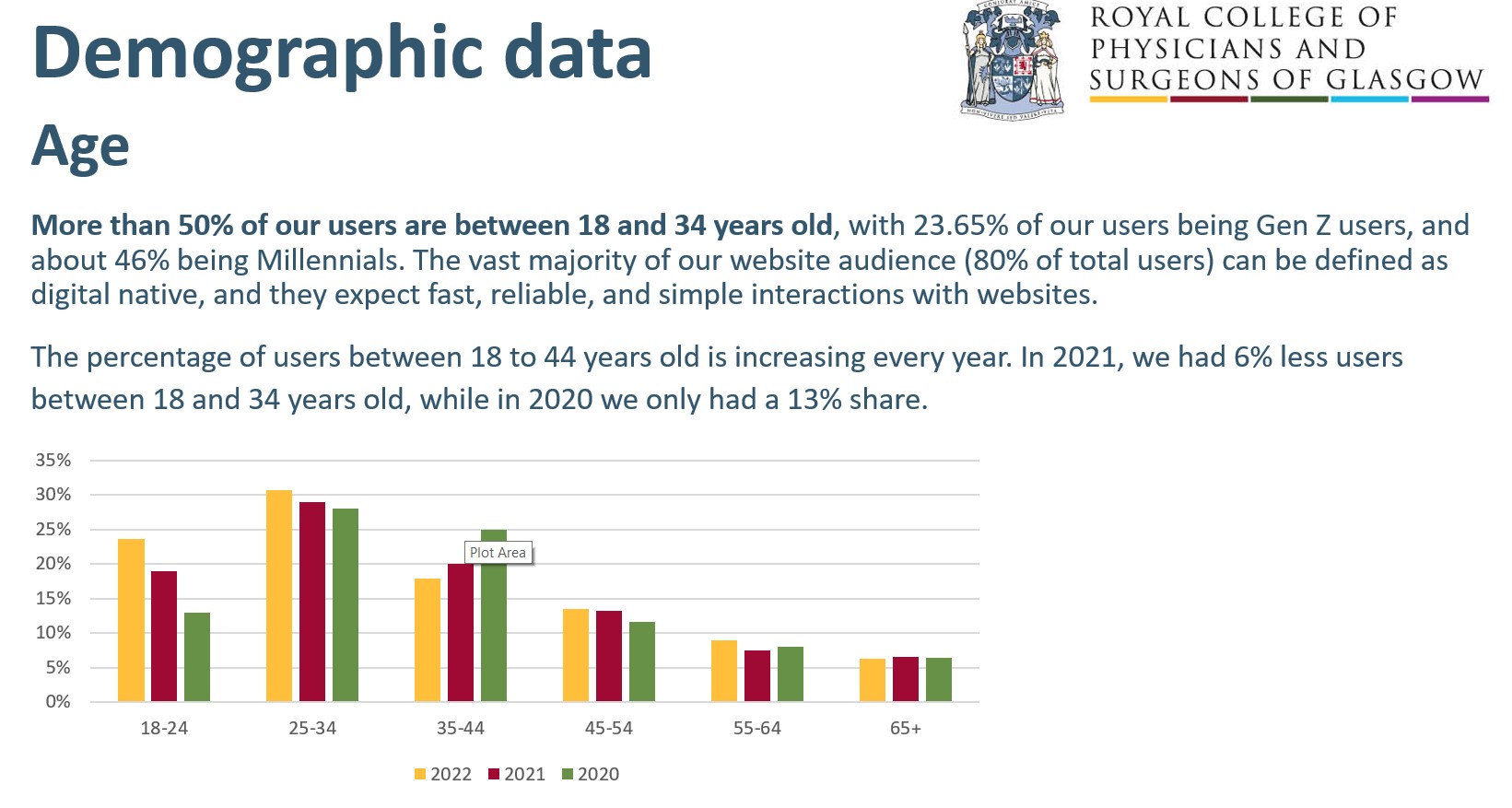
- Audience: Healthcare professionals are one of the most difficult audiences in the world, they have no time, no patience and they are not very open to changes.
- Tools: People in the organisation weren't used to wireframing and prototyping tools like Figma, so introducing and integrating them into existing processes was a challenge.
- Web standards: There were no coding standards in the organisation, so every platform was very different from the others. One of my objectives while working for this organisation was to centralise as many platforms as possible into one system that could be easily managed.
- Accessibility: One of the key values of the organisation was inclusivity, so the new website had to be compliant with the WCAG 2.1 AA rules.
- Content: The existing website had more than 4,000 pages, and content was scattered among a plethora of sections that needed to be adjusted or completely removed from the Information Architecture.
- Existing processes: The organisation was used to working with processes that were very different from user-centric processes, so one of the challenges of this project was to develop new processes and train staff so they could manage them.

The Actions
- Expert evaluation: I decided to spend part of the budget I had to get an expert evaluation of the website done by an external consultant to build momentum on the UX effort of the organisation. Having a renowned agency presenting its findings and the proposed solutions to management was a great way to build authority over this completely new stream of work.
- Usability testing: After the findings from the expert evaluation had been shared with everyone, I continued getting data and insights from users by involving them directly in the process. Talking with users, inviting management to participate as observers and involving every team in this new process made sure that we not only had data to power our design decision but also the much needed support from the organisation.
- Card sorting: One of the main pain points of the existing website was the amount of content and the complicated navigation it offered to its users, and I knew that a redesign wouldn't have worked without rethinking the navigation of the website. For this reason, I organised a remote card sorting exercise involving as many people as possible, trying to get a mix of different faculties, demographics characteristics, and professions.
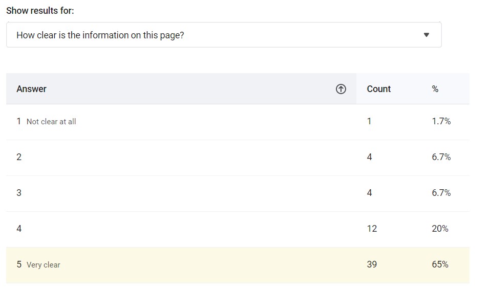
- Passive qualitative analysis: As budget and time were limited, we couldn't organise many direct sessions with our users, so I started doing what I baptised as passive analysis; I installed HotJar on the existing website and I started analysing heatmaps, eye-tracking maps, and using recordings and surveys to get data about CTAs and all the different areas of the website.
- Quantitative analysis: To build a strong case in favour of a user-centric model and culture, I knew that I had to use numbers and quantitative metrics as well, and this is why I automated web reports using AppScript so that marketing reports could be seamlessly integrated with web analytics. In addition to this, I performed an analysis of customer support enquiries to understand what were the things our users were searching for but not finding online.
- UX Strategy: After three months of analysis, I developed a UX and Digital strategy based on the principles of Human-Centred Design for the organisation. The strategy would define the strategic web efforts for three years, giving a clear view to the organisation and a structure to their business and technical sides.
- Workshops: After the strategy was approved, I started moderating workshops inviting people from all areas of the organisation. The purpose of those workshops was to get everyone closer to the Human-Centred Design principles, while at the same time working on some of the issues that we needed to address during the redesign process. I also gave staff-wide presentations to showcase the results we were getting with our UX quick wins.
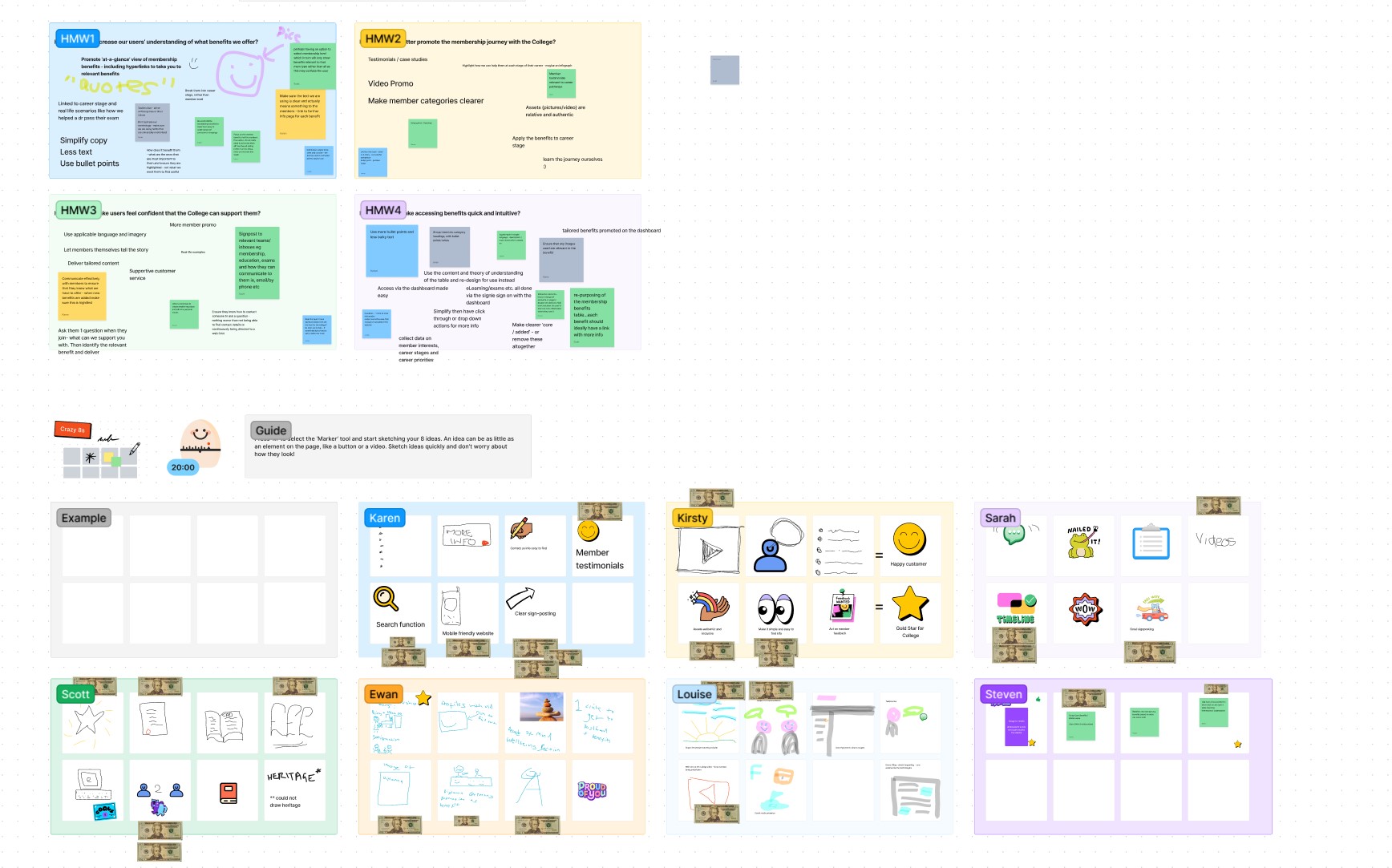
- Design Studio: The workshops were followed by Design Studio activities in which we went through How Might We sessions, Crazy 8s sketches and $100 tests. This was a great way to include other people in the design process while also introducing to the business online collaboration tools like FigJam.
- Redesign: Before starting the redesign effort, I categorised and listed all the changes we were going to apply, with specific user evidence that justified the changes. We knew that design decisions could become political, and being able to quickly show the evidence behind our decisions greatly helped us taking the right decisions for our users.
- New standards: I recognised that maintenance would be as important as the redesign, and this is why new coding standards and new processes were introduced to the organisation to make sure that Human-Centred Design principles would be respected even after the project ended.
Overcoming The Challenges
- Culture: Staff presentations, workshops and Design Studio were the tools and techniques I used to get everyone on board. The UX Maturity of the organisation was very low when I started this project, so I knew that I had to build a strong relationship with every part of the business.
- Limited Budget: Having a limited budget meant that we had to use our resources wisely. I built momentum by collaborating with an external consultant, and then by investing in a platform, HotJar, that could give us data continuously.
- Audience: Organising usability testing sessions was difficult, but by meeting our audience halfway we managed to complete a good number of interviews. I worked at odd hours, and I got used to suddenly rescheduling sessions, but we got the data we needed!
- Tools: Introducing Figma and Figjam wasn't difficult when management understood that making changes to a low-fi wireframe doesn't cost as much as asking a developer to make changes to the code!
- Web standards: By introducing coding standards, for example BEM for CSS, I made sure that the new solution could be maintained effortlessly by new developers as well.
- Accessibility: Although this was one of the most difficult challenges, I managed to obtain a WCAG 2.1 AA certification at the end of this project.
- Content: Using the insights from the card sorting exercise and the heatmaps from HotJar I was able to reduce the number of pages from more than 4,000 to just a little bit more than 200.
- Existing processes: Collaborative design was the key to overcoming this challenge; including other departments and people from the start, being transparent about everything and collaborating with management made sure that the new processes were understood and adopted by the organisation.
The Results
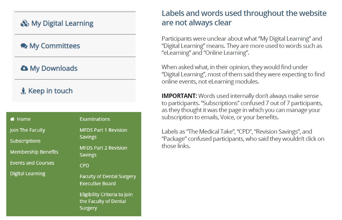
The launch of the new website was a success, we not only reduced the number of pages to around 200, but we also managed to increase the traffic on the website by 72%. Feedback scores across every area of the website improved, and the people who participated in our research spontaneously sent me positive feedback about the redesign of the website. Personally, one of the most important successes of this project was succeeding in changing one of the expressions used in the organisation to a more user-centric one, and one that takes into account the importance of writing for your customers, and not just for yourself as a company.